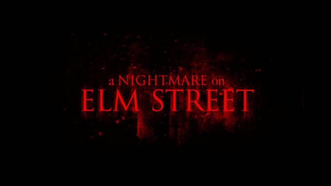
The choice of font needs to be clear and easy to understand so the title is easily recognisable. If a title becomes recognisable then the title will become easier gain attention. In terms of the font suiting the genre of the trailer, it needs to be easily distinguished as a horror so the audience knows immediately what type of trailer it is. We feel that the font we have chosen is the best possible choice for our OTS as it creates a spooky affect. the font plays a great deal in the viewing of a film, the font needs to keep to a specific theme, for example you wouldn't use the Indiana jones font for a horror film same being said the night mare on elm street font theme wouldn't fit star wars. the font plays a deep part in the presentation of the film and must keep to the films genre.